For most of my life I didn't believe in crap like seasonal
affective disorder. Not to the degree that it can be
debilitating in any substantial way. But lemme tell you, I
don't do well in the winter. It's draining, exhausting,
depressing, it's hard to make decisions, nearly impossible
to stay focused on anything and one day just bleeds into the
next. As much as I am a prime example of it s.a.d. ...I'm
starting to think it may be more in your head than in the amount
of vitamin D you're not absorbing from the sun.
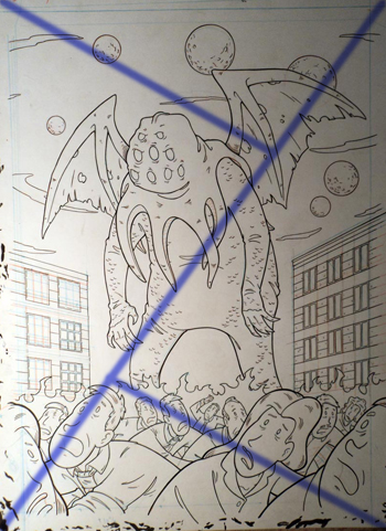
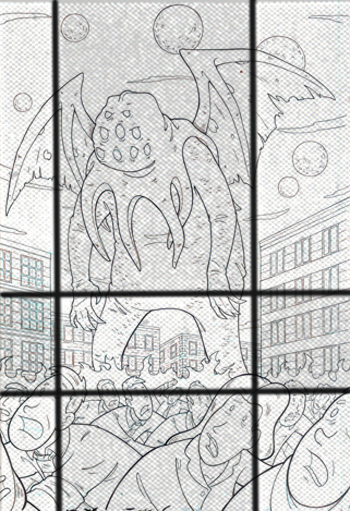
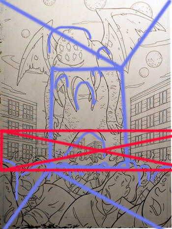
...okay, this'll help explain. I was about done with this
illustration for a H.P. Lovecraft trading card set.
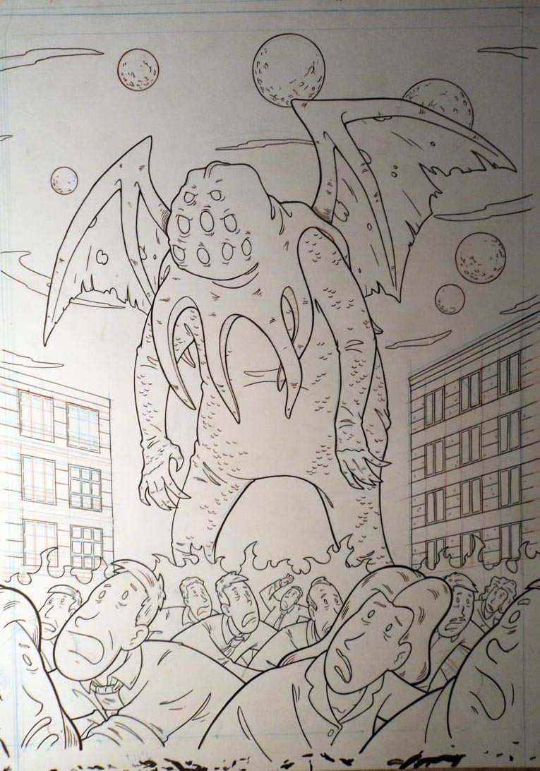
looks okay but the composition...is technically not good.
Since this job is mostly in your head, beauty being in the eye
of the beholder and all that, you want to guard against making
things that only you see the charm in.
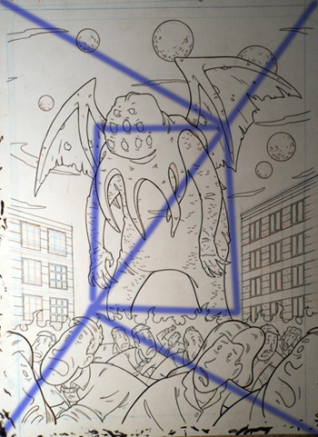
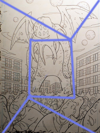
From what I can get my brain to remember, you determine the
sweet spot of a image by drawing a line diagonal all the way
across in one direction, then make diagonal lines from the other
corners to make 90-30-60 triangle.
then you make a square and that's the central focus of the
eye...or something like that, really it's just the center of the
picture so whatever.
You don't have to jam the important stuff into that spot, but
you need to be aware of the eye starting there. and what's there
on this image? a whole lot of nothing.
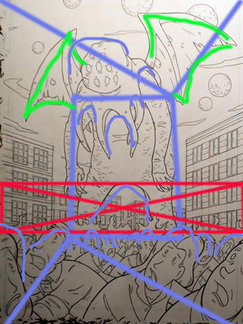
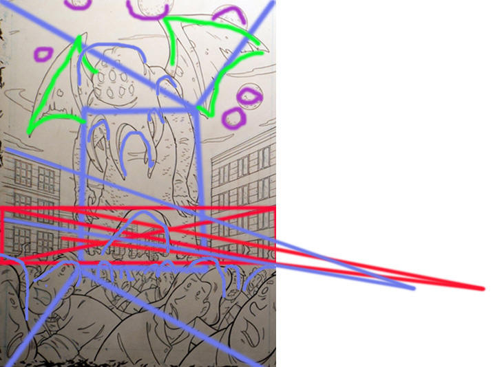
Originally I was going to have a tidal wave behind him but as
small as this will be when reproduced...it just wasn't going to
look good. BUT, I figure it could use something behind him to
keep t from being basically two different scenes stacked
together. I put some buildings in there, and it looks
good. connects him and the city and people together
nicely....but doesn't really do jack squat about the sweet spot
problem. I like it, but that technical problem is still
there.
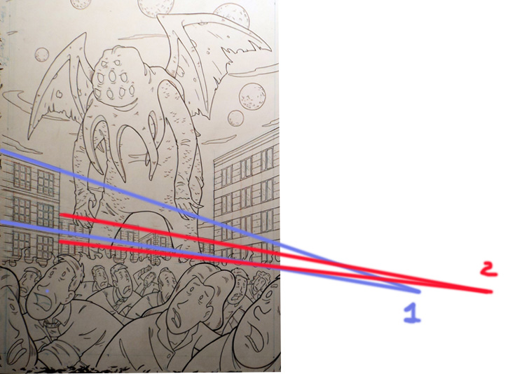
I gave the second set of buildings a different vanishing point
to give it a little subliminal movement. But that's neither here
nor there in solving that composition problem.
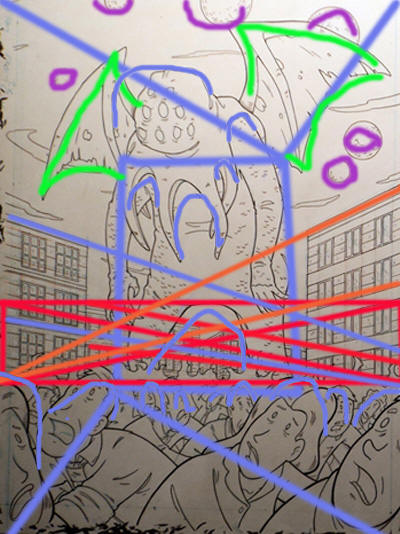
Soooo...why does it look fine? maybe there's some relationship
between the ovals top and bottom that's helping?

Whatever they are doing visually, it doesn't change the fact
that the sweet spot in unutilized and there is a big divide
between the top and bottom.
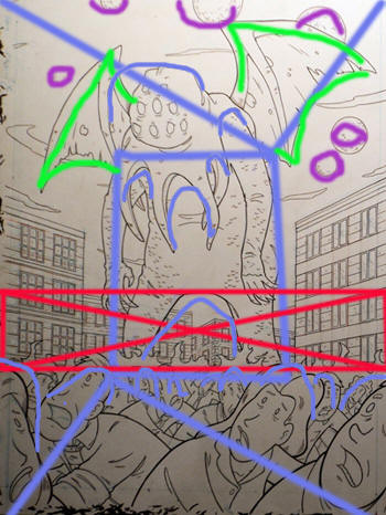
are the wings doing something? or the planets?
not really. Lemme see those vanishing points again.
Maybe it's the vanishing points from both sides helping this
somehow?
...
I decided to sleep on it. THEN, the next day, I get up and get
going and hear on the radio...the first spring season baseball
game of the year starting. Spring training? and my
brain said "holy f*ck, it's almost spring!" and just like
that, the weight of the world was off my shoulders, and my
focus, energy, motivation, came back and everything was fine.
and I look at this...
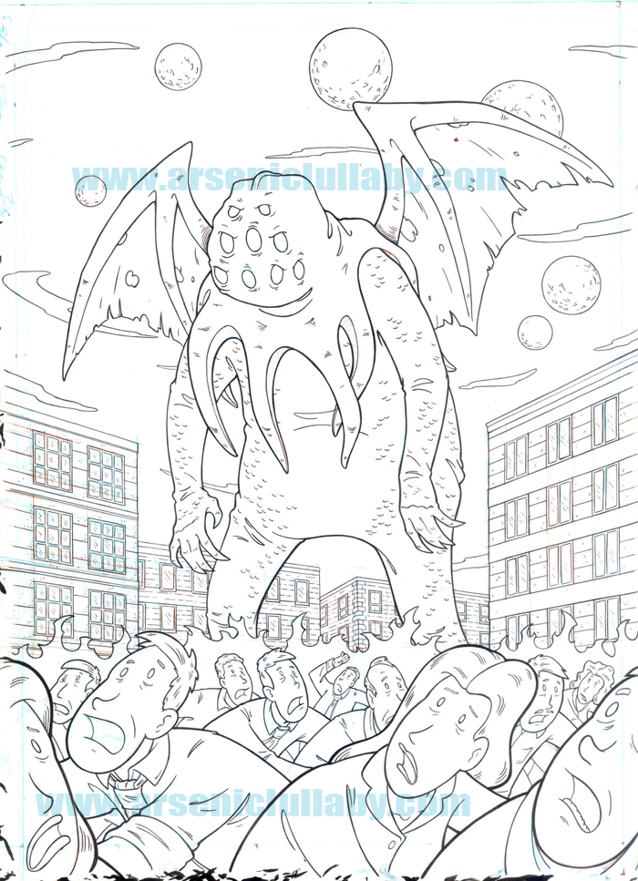
and says "it looks good, what's the f8cking problem? Maybe it's
good because there are two different things visually
separated...who the hell knows why something looks good? scan
the fucker and let's go, we got like three months of shit to
do."
...I've been much better since spring training started.
Oh and by the way, while looking for something else on my
computer, I saw this guide for what's known as the "golden
ratio" as set in a rectangle.
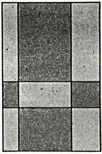
The golden ratio
is a way of dividing things visually that is seen a lot in
nature and used in architecture. It's a ratio that the eye
always finds compelling.
...Oh for F*CKS SAKE.
Not that I need reassurance anymore...but that's pretty much
SCIENTIFICALLY confirmed as good.
Anyways...more previews next time.
_________________________________________
Have friends who might like
Arsenic Lullaby?...tell them to sign up for the Arsenic Lullaby
Email
HERE. Thanks in advance.