|
|
"the tools of ignorance" Lettering and inking/comission request advice
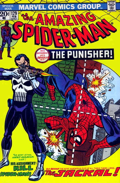
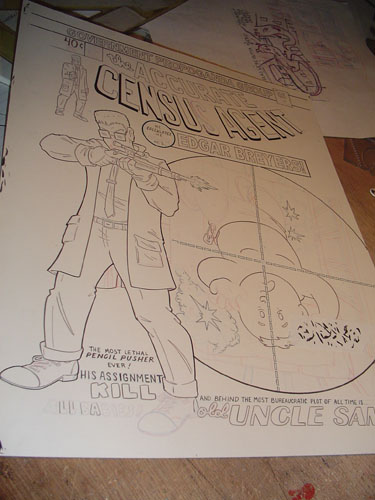
Okay so, A nice chunk of business you get as an illustrator is commission requests...which logically means a lot of you request commissions from your favorite illustrators. Here's a tip to make sure you you get a commission you are happy to show off. Consider what about this particular illustrator makes him a favorite, what is he good at? What does he excel at? Requesting that a guy who draws big tits all day to draw you a picture of your car is probably not going to turn out as good as you envision. Take me for example- there are probably a thousand guys out there with a more interesting style when you break it right down. I make by bones with detailed backgrounds, unusual camera angles and of course punch lines, and expressions. I've (for reasons that only the zeitgeist knows) five times had to steer people away from having me redoing the cover of The Hulk no.1. This is a great cover but has nothing that I can really bite into. It's a simple camera angle, not much in the way of back grounds and mostly the composition revolves around a large central figure. If I where Leinel Yu or todd Mcfarlane this would be a perfect cover to do...there would be bulging sinewy muscles and nigh bursting viens, all nicely done. But for a guy with a very simple cartoonish style this cover would turn out dull and sub par. I could do it, take the money and deliver my takeonHulk no.1 but it wouldn't be worth what I would charge and that's bad businessand worse bad for the ego. I got a commission recently that really hit the nail on the head. The gentleman wanted the cover of spider man no.129 (first appearance of the Punisher)
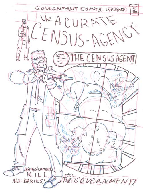
He wanted it redone with Edgar Breyers from Arsenic Lullaby in place of the Punisher. This was a brilliant request. It's a landmark cover so people will recognize it as a parody right off, AND it compliments my style. A lot of words to change around for the sake of a laugh, interesting camera shot, and even though it has a large central figure, there is a lot of detail to exploit, most notably the rifle. Via e-mail we both scoffed that the rifle in the original was made up and resembled no actual rifle we know of. So right there I have a way to add an inside joke at the expense of the original cover. I gave the rifle some thought. Something modern? ...a shotgun would be funny since his target would obviously be a baby...nah...Seeing as how Edgar is deep deep in the covert field of the government- Lee Harvey Oswald's rifle would be perfect. done and done. a quick thumbnail sketch letting the patron know what I had in mind and off i go..
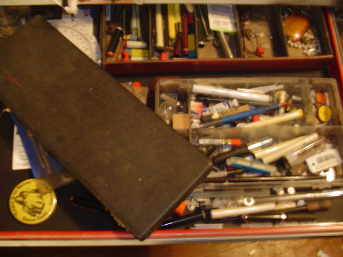
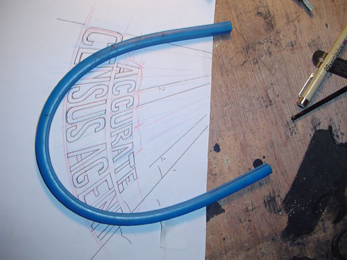
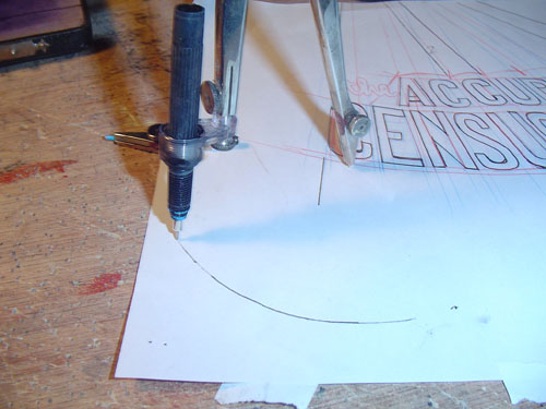
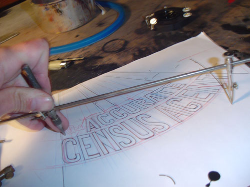
Onto the problems...or "challenges" as more optimistic people call it. The lettering was a BITCH. Regular modern lettering is fairly easy to mimic with new words but this was done back in the day...old school. Here's the thing about lettering back in the day...it was every bit as boring as it is nowbut they HAD todo it by hand. SO often to make it interesting to draw they pulled out a few tricks. this logo is curved, and has a vanishing point (like the words atthe beginning of star wars) either element is tough...both are what I refer to as "something I should have noticed when Igave the price". I did a quick mock up of my own curved version that i was all set to slip onto the light table when i realized...this logo does not only curve down, and has a vanishing point it is ALSO slightly larger at the front than and the end...it curves down and expands left to right, and expands top to bottom. AND the top curve is different than the top curve. this was done old school and will have to be redone old school...WITH OLD SCHOOL TOOLS. This allowed my do break out some of my more archane drafting supplies. FIRST my bendable straight edge.
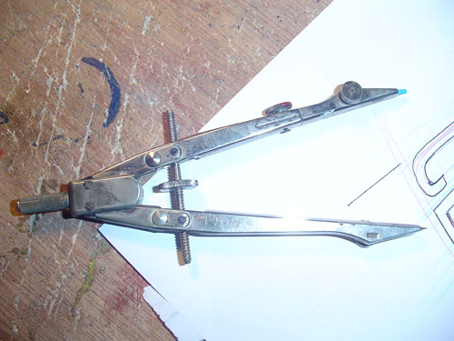
This thing is pretty cool, it's plastic with some kind of pipe cleaner metal insert, you bend it to the curve you want and it holds that shape. The only problem- after you've used it for ten years there are so many kinks and curves in it that you really have to flatten the bastard out before it will make a true curve again. that and you can't ink with it, if you try to run your pen or brush along it the ink just bleeds under it and/or smears. The second problem is this bastard has a lot of circles. You all know what this is, it draws circles.
But what about inking circles? USUALLY this isn't an issue. i just partially disassemble my technical pen, and attach it to the compass with an adaptor and off I go.
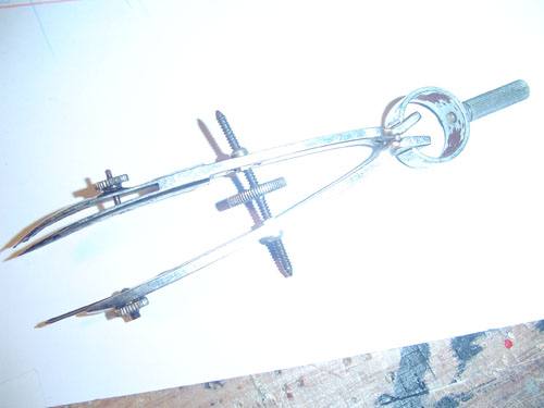
HOWEVER some of these circles are too big and too small. this brings us to this horrible object.
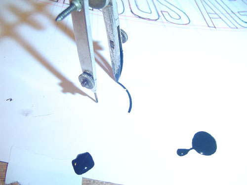
It was devised by a think tank of nazi scientists, witch hunting puritans, and the guy who invented the iron maiden. It is a tool of such exquisite torture that the most hardened prisoner would gladly confess before being forced to use it to ink a circle. The tip is basically an adjustable dip pen. You have to fill the tip with an eyedropper and then adjust the thickness with a tiny wing nut. Then...you have ONE and only ONE chance. The split second the tip hits the paper you have to draw that circle in a quick smooth motion. If you stop or slow down the tip digs into the paper and ink bleeds leaving a bulge that can never be undone. Even opening the tip width to draw the whole circle the size of the budge can't save you because as soon as you spin it and the tip hits that grove it will skip and spray. ONE chance is all you get.
The big circles are even more horrid. You use a similar tip after assembling this hellish contraption. It was designed in Salemduring the witch trials, they gave it to you and if you could actually draw a circle with it they knew you must have used blackmagic and they stoned you to death...which is more fun than using thisto draw a circle.
Re-lettering old school logos leaves you choosing between the lesser of too evils. Do it with a technical pen and have it look like you used a pen(which I think takes away from the peice..you want people seeing the image not noticing how you did it) OR use a brush...giving the lines more consistency and a very "arsenic Lullaby" style and look...and getting arthritis. I chose the later. tech pens are, except in extreme circumstances, for pussies. On the upside, after all that, drawing Lee Harvey Oswald's rifle with historic accuracy seems like a walk in the park.
I'll post the final once I figure out what I did with the scan, but you get the idea. Percise details, old school look, that's my strong suit. Other guys have other strong suits...find something that compliments the style of the Illustrator and their knolwdge and skill set will usually give you more bang for your buck than you expected. For info on how YOU can torture me with your commission requests go here
www.arseniclullabies.com
|