
To say I work differently than other NFT
artists would be a colossal understatement. When
everyone else is discussion the programs they
use...I slowly slide away and glance to my left...
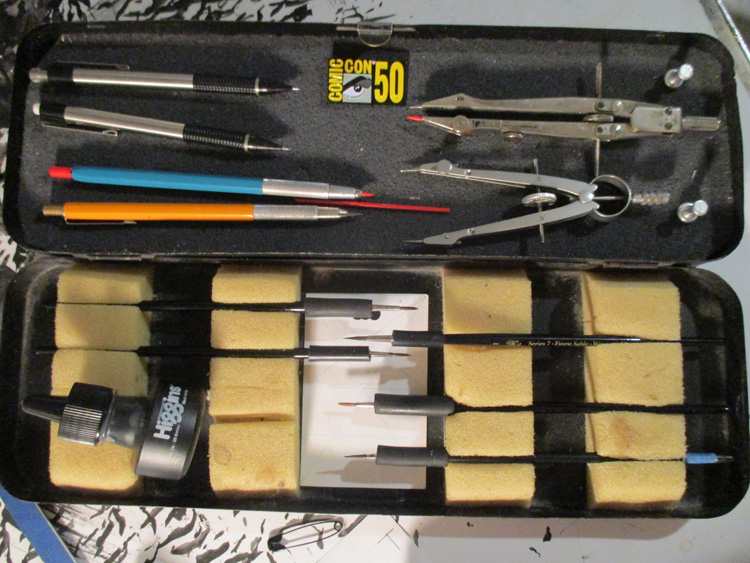
Yeah...I uhm...I use the Winsor Newton series 7
no.0...it's an ink brush. Hey...that's 2000 some odd
years of brush making advancement right there.
(shrug) Oh course though, I color it and animate it
on a computer, I'm not a total Luddite.
Look...see...I have a computer...
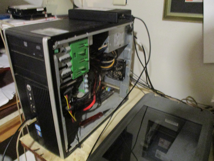
I think I got that when Avengers Infinity
war came out...or maybe before. Sometimes I gotta
jam that pocket knife in between the ram and the
slot it goes in and jiggle it until the computer
recognizes the ram card.
In all seriousness I
do have a better computer, but this one has a bunch
of obsolete programs that I can't find anymore...and
I haven't had time to figure out how to use the new
versions. I'm a busy man.
The point IS...we
all have our own creative process and no one knows
where creativity comes from or how an idea develops.
It could well be that the tools you use sway the
kernel of an idea in different ways. And if you're
happy with the results, then that's what counts,
whether you are using procreate, a spray paint can,
clay, or ink.
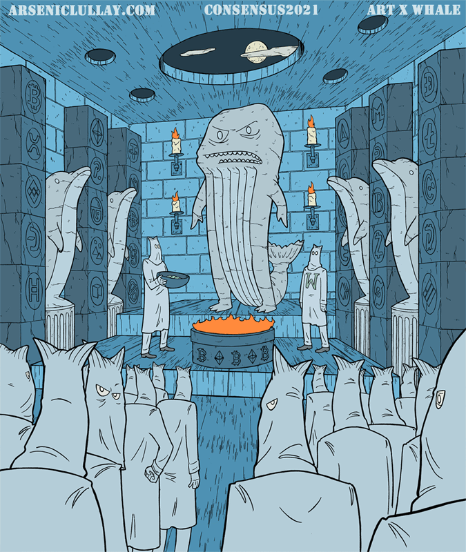
Onto this piece being featured
at Consensus, thanks to the Whale community!
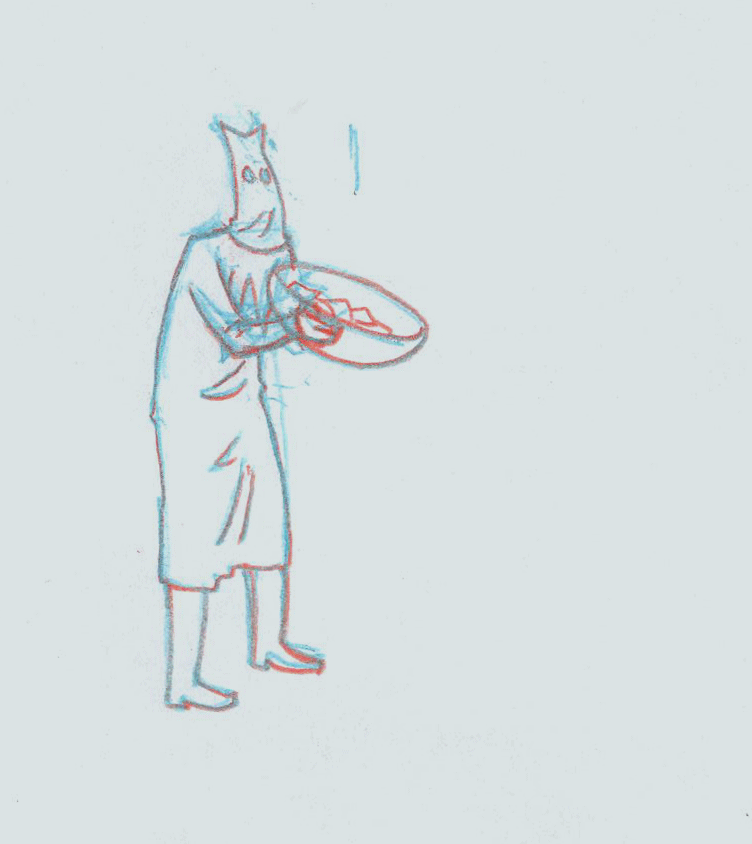
The beginning of one of my works is always a quick
scribble/sketch. Sometimes of a visual I have in my
head, sometimes I just sketch until a idea appears
on the paper that I like.
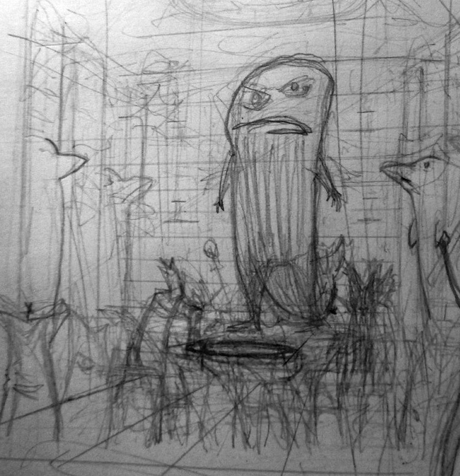
And that's the foundation...from there I
generally figure out the vanishing points/proper
perspective, where the camera would be ( above the
scene , below the scene, eye level?). Most shots use
2 vanishing points, one on the left, one on the
right.
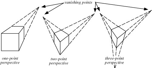
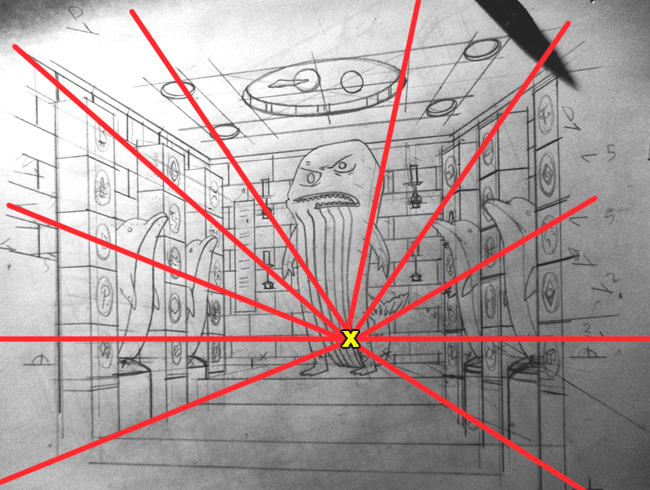
A straight forward shot,
like in this case, only needs one, but that can
make for a visually boring piece, as every line
would be angling to the middle of the picture...it
forces the eye there and keeps it there. If you want
some energy and life, you want that eye bouncing
around a bit...exploring the illustration.
When you're animating...you can use movements to
bounce the eye around, but I still like to do some
of that with the beginning composition.
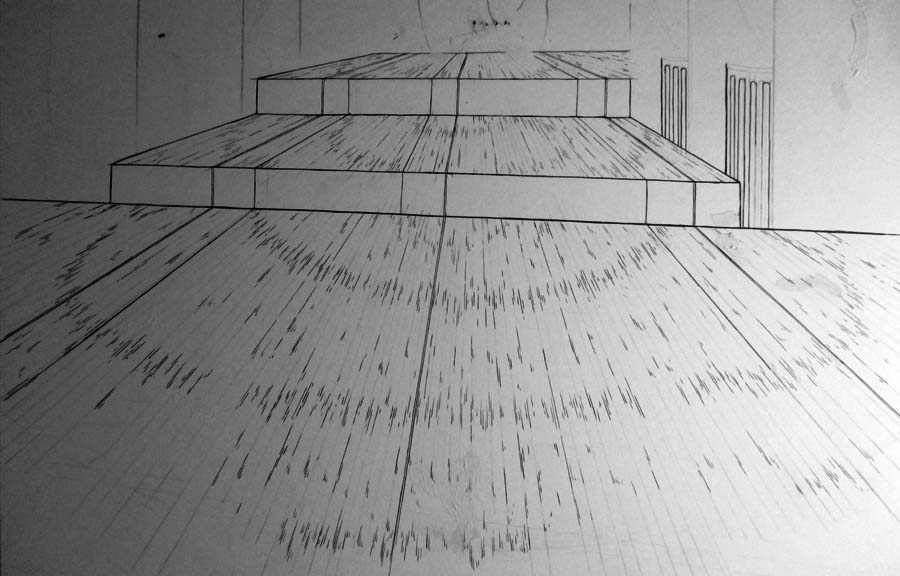
In this piece (below) the
blue line would be the level the camera is at...and
to keep things visually interesting I gave a
vanishing point for the left and right upper lines,
left and right bottom lines, and a couple for the
lines that would be towards the middle...
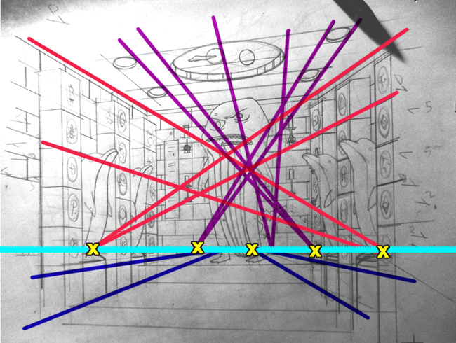
That's complicated and a lot of planning and
technically with a straight forward shot you'd just
need one vanishing point...meaning all the
horizontal lines converged onto that one point and
it'd be boring AF
SO...anyways...that's
the background of the whole thing. Once that's
figured out I can do the final pencils and inks and
have the foundation for the figures and movements.
It's a good solid background and gives me confidence
that the rest doesn't have to more than it's fair
share for the piece to be interesting.
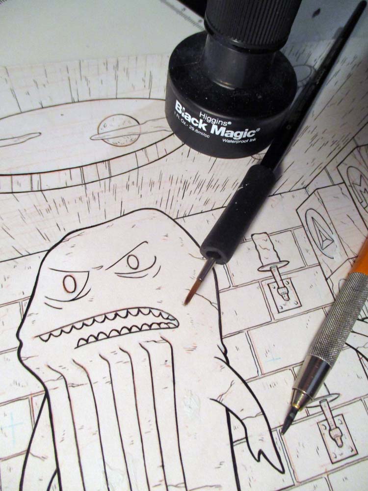
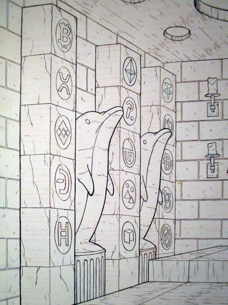
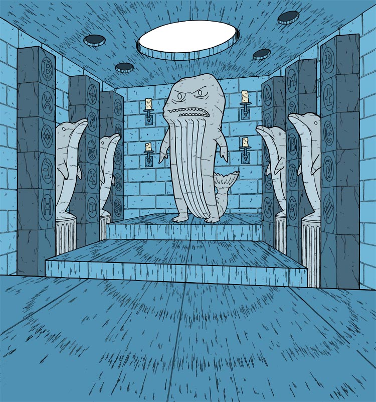
So...yeah...inking this bastard...was no easy task
and
sadly....that one up there, I ended up screwing up
and starting over...which was good actually because
I had realized that the scroll/banner hanging from
the left hand side was going to make a visual mess
once the figures and movement is added,
so...yah...did it over
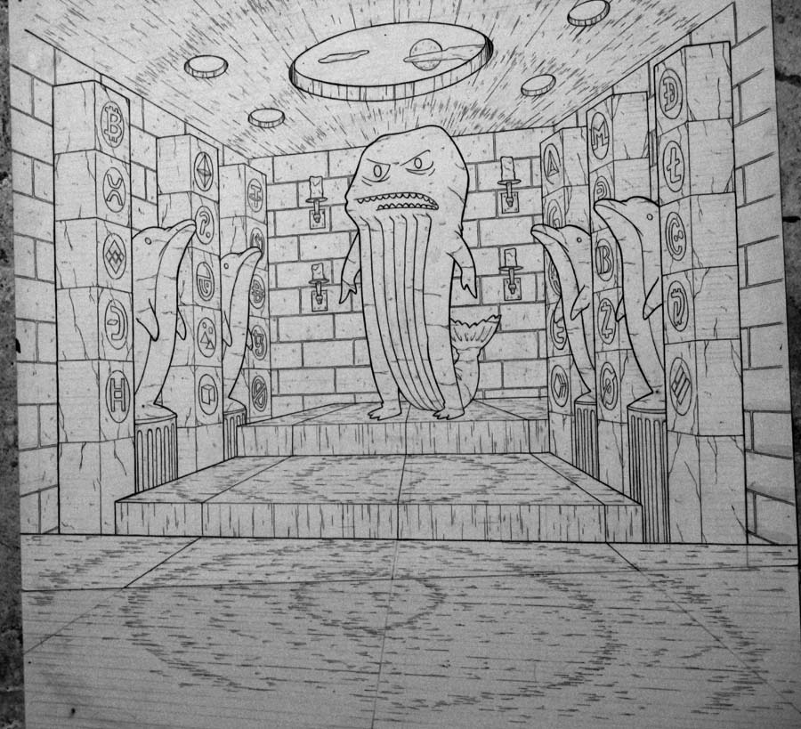
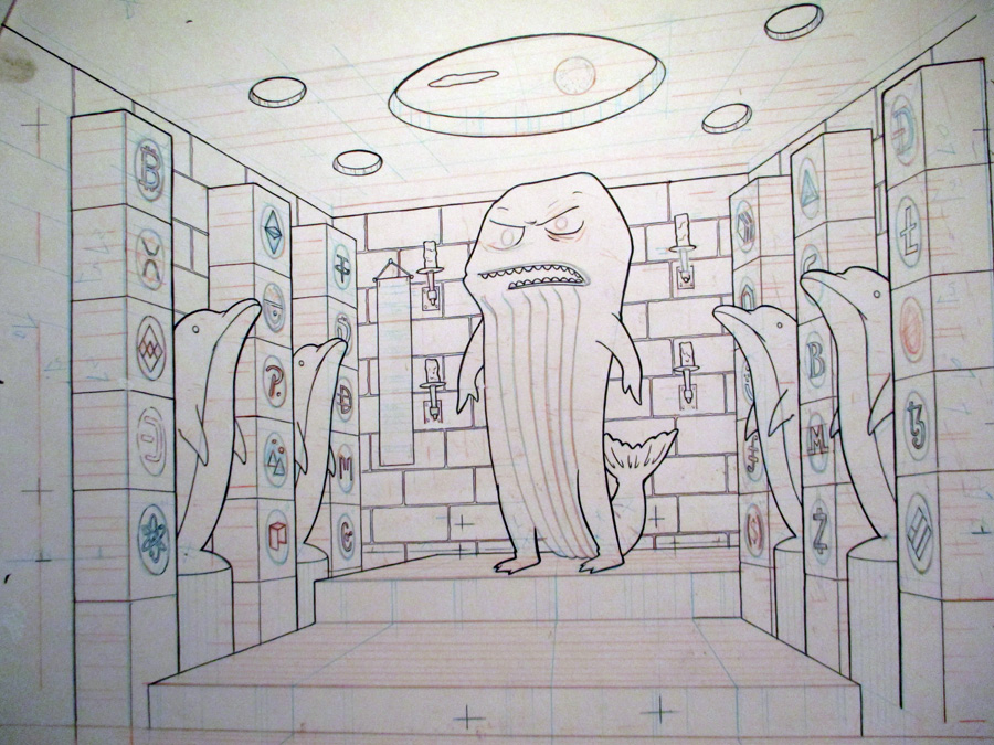
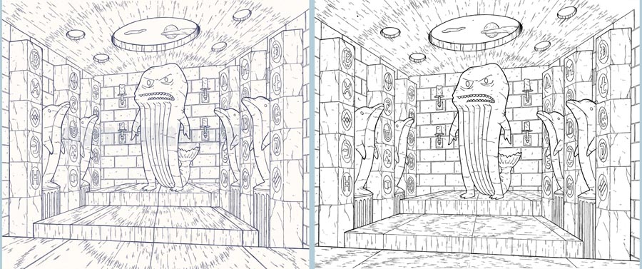
The pattern in the texture of the floor, I
originally was going to have sort of just flow into
the center vanishing points , but instead went with
that circle patter thinking it would work better.
BUT after adding some of the animation I decided
...the circle pattern was an example of being too
smart by half. I had already done enough with the
vanishing points to make sure the a burst pattern
wouldn't be optically oppressive ( that's a term I
just made up now), and the texture flowing towards
the middle worked better...
check em out side by side...see how the first
makes the floor seem a bit narrower, makes you feel
as though you are viewing it from just a slightly
different angle, kind feels different? Ain't optical
illusions amazing?
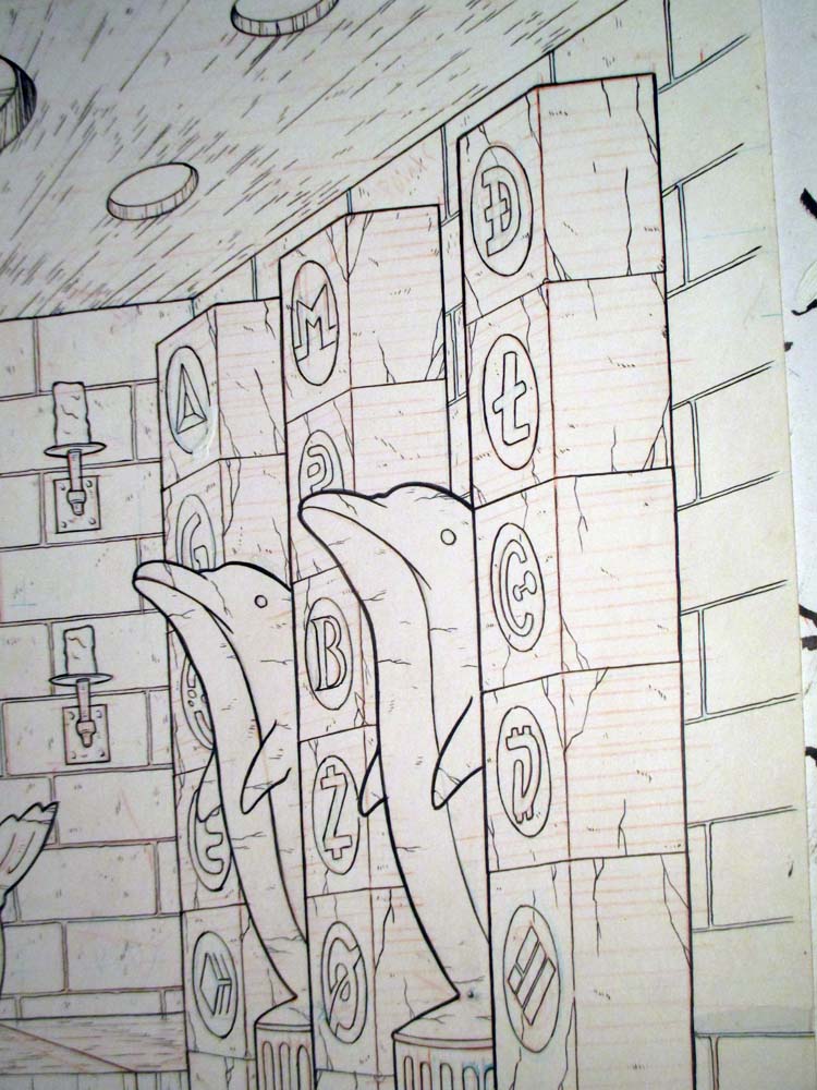
BEFORE...we move onto the other layers and
animation, lemme just show off some of this inking,
because...it turned out pretty decent.
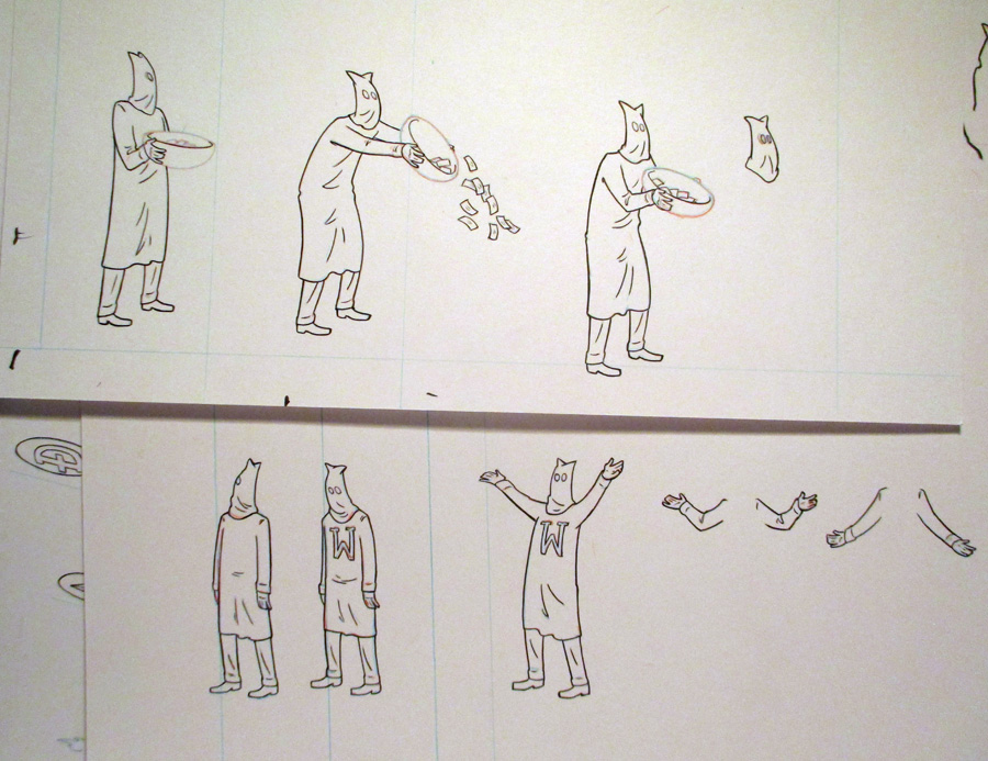
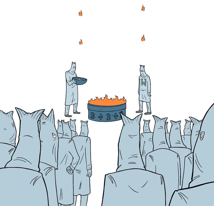
SO...then I decide on
the movements, and draw up all the figures and
things that move or stuff that need to be on a
different layer and ALL the variations of anything
moving, like old school animation cells. This is an
instance were doing it old school has a purpose.
There are animation programs that are great and save
time and I have used for longer things, but when you
are using hand drawn elements they leave visual
flaws and technical inaccuracies. If this was a 20
minute cartoon...I'd cut some corners to save some
time. But I put the work into the details off the
background and so the details of the figures and
everything else...on every cell...needs to have that
same level/style of detail or it'll stick out and
just not look as good.
So, to me it's worth
the time. I won't deluge you with all of it, but
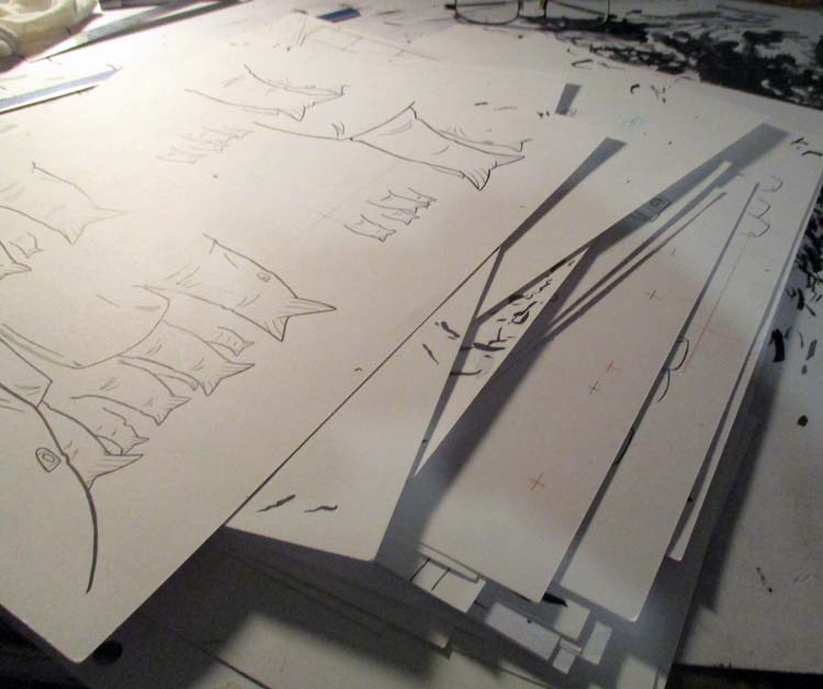
here's some samples...
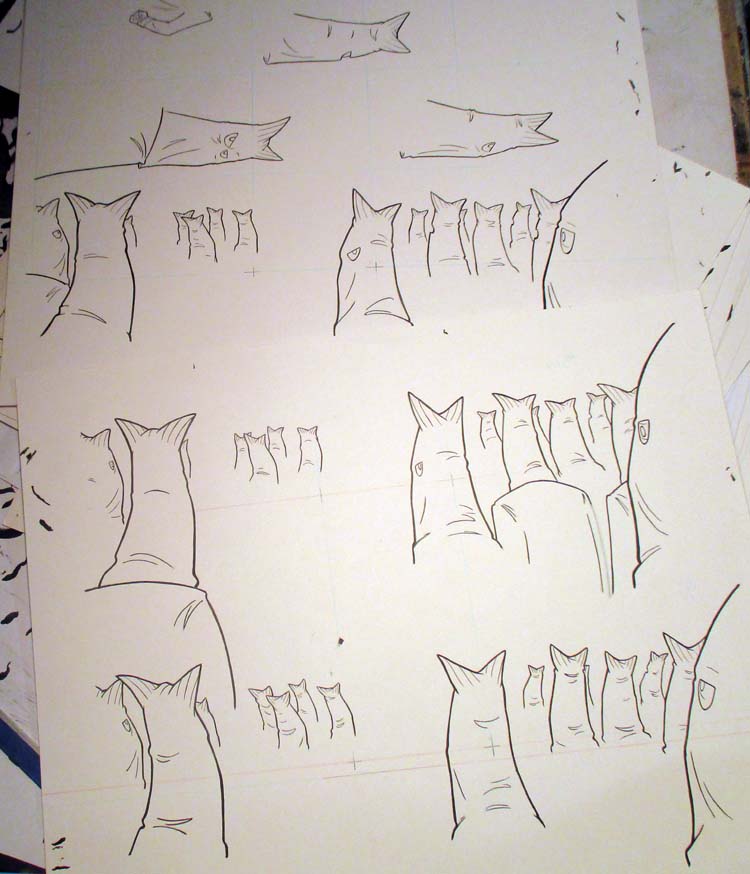
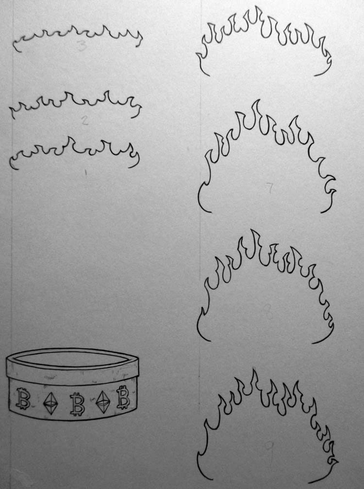
There's more fire and figures, but you get
the idea...here's the whole stack...
NOW...all kidding aside, I do know my way around
animation programs and such. I produced a 30min
animated pilot, have done story boards and such, had
cartoon shorts on comedy central. Admittedly though,
these programs advance and get better by the month
so I am a bit behind. I'll show you why I felt hand
drawing lots of cells instead of using the computer
shortcuts were important in this one.
In most
animation programs you can take a element ( like a
head) and attach it by a hinge.
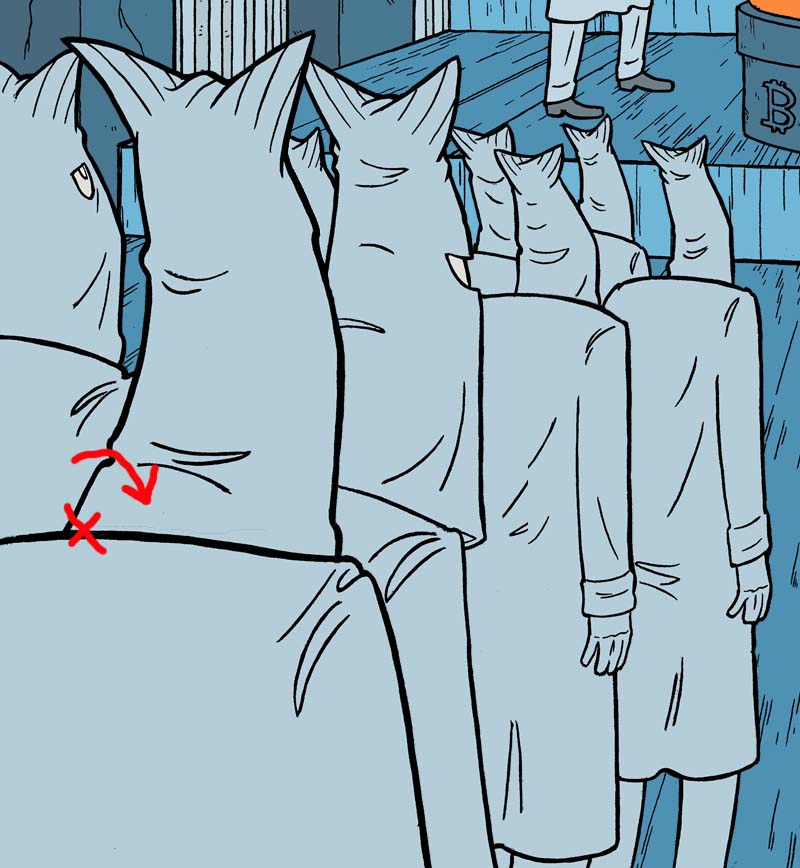
And you can simply bob the drawing of the
head back and forth by the hinge
IF this were a 20 minute cartoon, that'd be
reasonable. And if it wasn't all hand drawn there's
a way you could make that work with a tweek or two.
But my goal is always to capture people's
imaginations, and anything that stands out from the
rest, even for a moment, can pull people's
imaginations out of the reality I've tried to
create.
The background and everything else
is cartoonish, but all has a certain level of
reality to it, a level of detail. The movements have
to have that same level/feeling. When one of these
guy's heads bob, the fins should bend, the lines on
the fins should bend with them, the fabric would
wrinkle more or unwrinkle...
It's a small thing...but
the difference between success and failure is doing
many many small things correctly. I think I read
that in a fortune cookie. Too bad I didn't get the
fortune cookie that said " screw it, okay is good
enough"
Anyways...before all of that inking
of moving elements was a bunch of tests of rough
drawings...
hahaha...this one cracks me up. Honestly,
this little test was the point I decided to really
go all out on this piece. I watched it and I myself
wanted to see wtf it was all about.
So...then
you color the background
and color the rest...
and animate the thing! Not much I can
explain about many hours of clicking a mouse and
shifting something over 2 pixels.
See this finished piece and works from other Whale Fam nft artists at
AVAILABLE FOR OWNERSHIP ON BINANCE HERE UNTIL NOV.7
More of my NFT art can be found here - https://makersplace.com/arseniclullaby/
More behind the scenes pics of other nft work- http://arseniclullabies.com/nft.html