| main menu blog index | |
|
|
A WORD FROM OUR FOUNDER
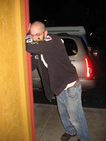
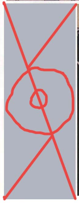
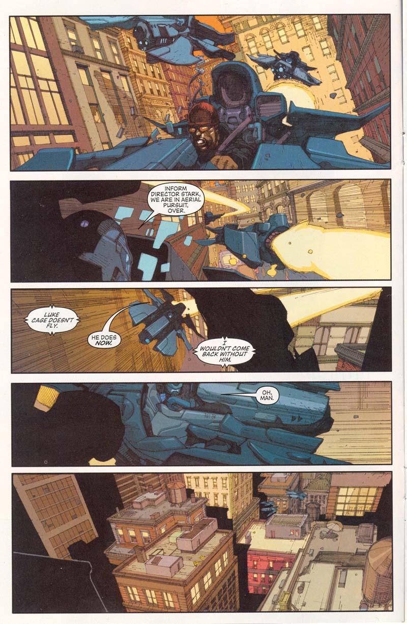
Separating the men from the boys or disecting "the new avengers" no.62 but i'm going to do a review here to show you the difference between a hack and an illustrator. here is a page out of a recent issue of one of the only comics i read - the new avengers. I started reading it again after YEARS of staying away from superhero books because the illustrator at the time Liniel Yu was so good. they have gone to some new guys and in fact recently they have been having several different illustrators on a single issue. each illustrator would draw a certin scene...one would assume to give a different mood to each scene. OR one could assume because none of these jerk off can meet a deadline. In either case you would ALSO assume the art would be better since each illustrator has more time than lineil yu had since they are each doing only a few pages. you would assume... here is the basic action that needs to be included in three different pages from different stories 1-Luke Cage eludes shiled agents on a flying motorcyclethingy through Manhattan...some dialogue is needed. 2-two soldiers hide from a superhero fight, one gets his head vaporized, the second one is knocked out 3-two villains watch as Spiderwoman zaps spider man, they descend and one is webbed up by Spiderman who is playing possum. just put those in your head, or even sketch them out if you like...below is how these "pros" handled it. and just a bit of info you'll need to know soon about simple composition. to find the visual sweet spot on a given area you draw a diagonal line through it and then diagonal lines from the other two corners at about a 45 degree angle. (see below and there you have the visual center of the image...the area where the eye will be most fixated. in a perfect square it is basically the center but as panels widen or narrow the spot grows or narrows slightly.
in a comic book, information that is necessary or is the point of that particular panel really should be in the sweet spot unless you are going to do some Frank Miller thing where the entire panel is black except for a red shoe in the corner, OR some tricks like the fellow below.
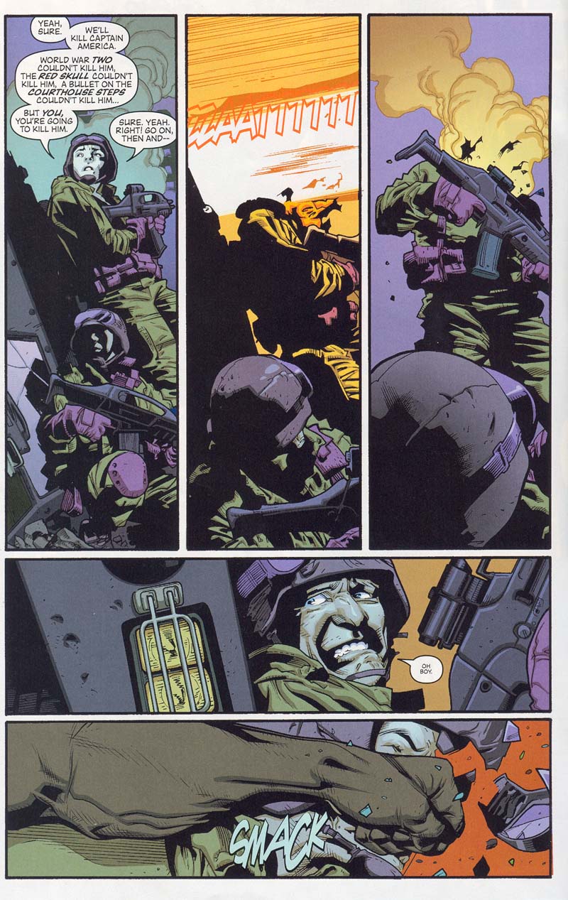
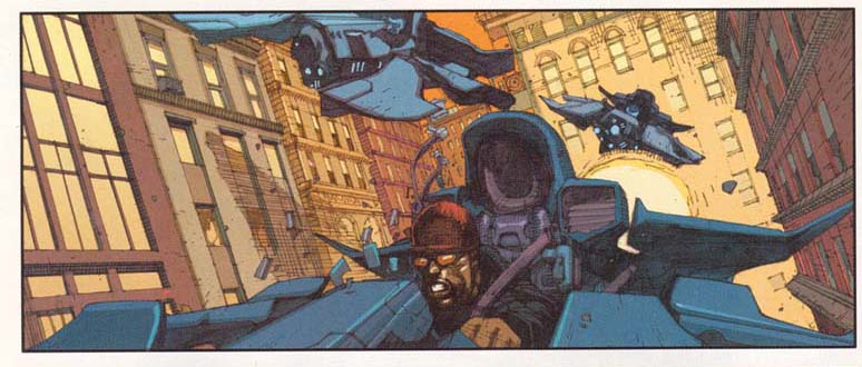
the page below was done by Stuart Immonen, who i never heard of, but is actually pretty darn good all the way around...and possibly a better story teller than Lineil Yu
see panel 2 and 3 COULD have been a simple cut and paste (like the dumbass who did the upcoming page) with modification done to the head of the soldier but this guy was savy enough to know that by bringing the camera in just a little it has the reader really looking over the second soldiers shoulder and putting all the emphasis on the flaming head even though it is out of the sweet spot. also the helmet taking up the bottom of the panel essential shortens the visual space moving the sweet spot up just enough...very tricky, very well done. the bottom two panels are TEXTBOOK! you cannot convey motion in a comic book much better than that. i'm gonna give away his secret here. a long panel implies a long period of time (as we already learned here in pervious entries) and theoretically the second panel should feel like it's taking a long time too right? but it doesn't...here's how he did it. your brain processes information at a cetin rate. the more information it is looking at the longer it takes to process. in panel 5 there is alot of detail to take in, lines on the face, wrinkles on the jacket, details on the gun, the headlights, a word balloon to read and some cross hatching. the majority of panel 6 is just a big arm and fist. your brain takes longer to process panel 5 than panel 6 even thought they are the same size and so panel six seems to happen in an instant in comparison to panel 5. AND ...to me...the most clever aspect is that he puts the impact of the fist RIGHT where the word balloon was...the spot where you spent the most time in panel 5, the spot were you stopped to read, is replaced in panel 6 by the impact of the fist. pretty slick my friend.
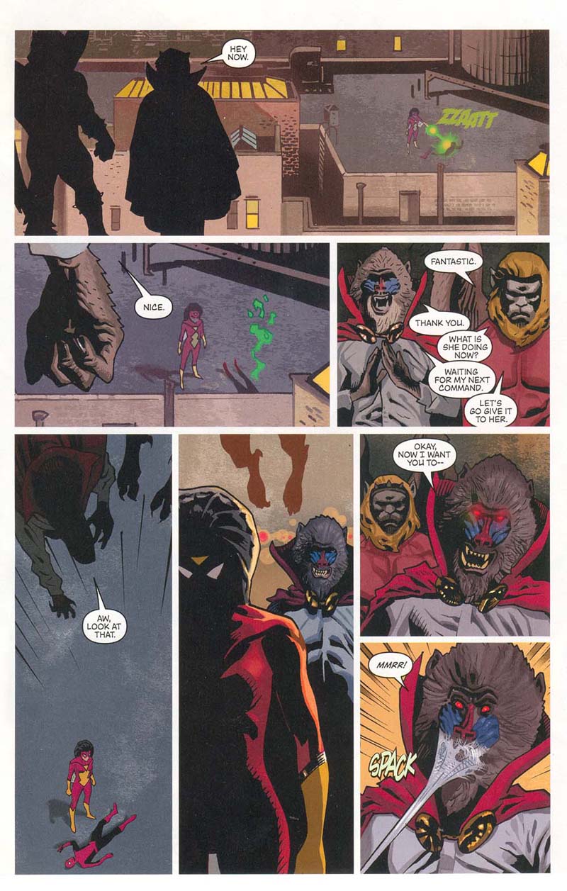
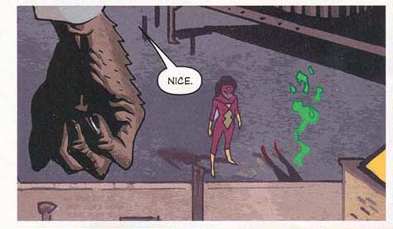
here is a page from this issue done by daniel acuna, take a look and then i'll tell you WHY it sucks.
now first off, we've got some shots looking down at some roof tops, then a shot of the onlookers coming down...from the wrong direction (they would have had to have flown all the way around the building to come in behind the woman since they were facing her in the previous panel.) by the way the speed lines are out of place here since this panel needs to convey "creepy" and not "action". the next panel really fucks up the whole page...we are suposed to be suprised that the monkey man gets webbed because up to this point the reader thinks spider woman is under his control and spiderman was really killed. the dope blacked out Spiderwoman because he didn't know if her face should look zombied or sneaky or what...it is important her that the reader think she is still under evil control...but shadow this makes spider woman look more creepy and ominous than the villain behind her. so right there you get a sense that something is up, and when he gets hit with webbing it's just anti climactic. a better way would have been to have spider woman facing away from the camera and the villain creeping up on her from the foreground. this keeps the tension and creepiness on the villains and when they get webbed it's got a bit more impact. the final panels are stacked because the dumbass didn't A- leave himself enough room and B- was too stupid to realize that panel 5 and 6 were redundant, and that the word balloon from panel 6 could have easily been inserted in panel five (and panel six eliminated) leaving plenty of room for panel 7 to stand alone. and i'm not even going to go into all the f'd up perspective on the buildings and water tower. not to mention this is an action book and the female figure's posture is wildly unexciting, even though she is zapping Spiderman she is standing and pointing with all the enthusiasm of a woman telling her dog where to crap. panels 3,6,7 are just dead on, shoulder up portraits- no fancy camera angles, no moody shadows, the panels are square and dull...that's three panels that COULD have been filled with visual information that adds to the mood and story that he basically pissed away. and panel 3 is over clogged with word ballons. this guy is either lazy or dumb. no...he IS lazy and possibly dumb. take a look at mr. Yu's page before i mock this new guy some more.
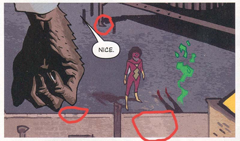
THAT'S how you draw rooftops asshole. THAT'S how you use perspective, and that is detail that pulls you in and helps you forget it is make believe. and THAT'S how you use speed lines. speedlines are used to convey speed not to fill up a panel you are too lazy to add background too. and i mean lazy. let's look at his panel blown up to the size he is actually drawing.
is there anyone out there who couldn't draw the female figure that well?...anyone? that figure is flat out poorly drawn and this guy is getting paid for it. the rooftop isn't much better. maybe some of you might have trouble doing the hand in the foreground but given that he had an entire month to do his 6 pages 90% of this panel could have been drawn just as well by any of you. and certinally better that 99% of the people who will be wandering around with portfolios at Comic-Con this year but it gets better...let's look at panel 1 and 2 side by side, blown up to match.
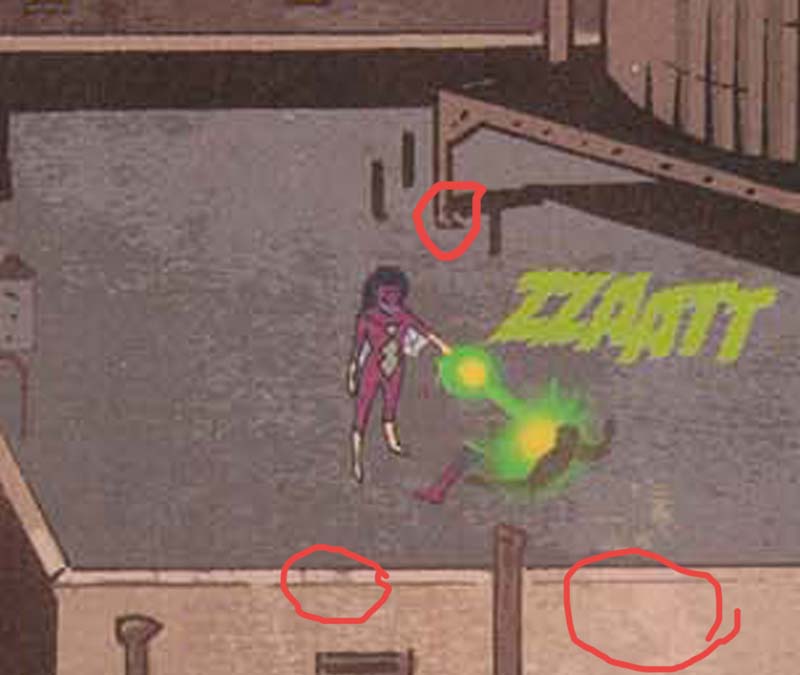
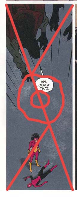
that's right...it's the exact same image. This scan isn't the best but i circled were you could plainly see that every last nook and cranny in the bricks matches right up. it is a cut and past plain as day. this lazy fuck drew it once...poorly and then copied and pasted it. wow...he's sure earning his money. once last laugh here... in this panel the dope "choose", and i use the word "choose" even though we know he didn't consciously choose anything he just crapped out a drawing, to use the visual sweet spot of this panel to convey...
...nothing. the word balloon sort of sneaks in but the dialogue in this image is essentially meaningless where as the downed image of spider-man, the blank expression of spider woman and the eeriness of the descending villains are all out in left field. nice work dousche-bag. this is a page that any of you given enough time could draw and most of you could layout better. where as if you asked me to do a page full of panels like THIS
I'd tell you to go fuck yourself i don't need carpal tunnel syndrome and if i could draw buildings that well i'd be an architect not an illustrator.
comments? concerns? myspace.com/douglasarseniclullaby www.arseniclullabies.com
|