|
If you held a gun to my head I would say the moving the eye
around the page is by a hair the most important aspect of telling a
story in a comic book. If it doesn't flow right or is cluttered it
becomes visually unpleasant to read and if they don't read it- nothing
else matters.
Here are the basics that I used on the first two. Again the goal is to
lead the eye from left to right top to bottom of the page…just like
reading words.
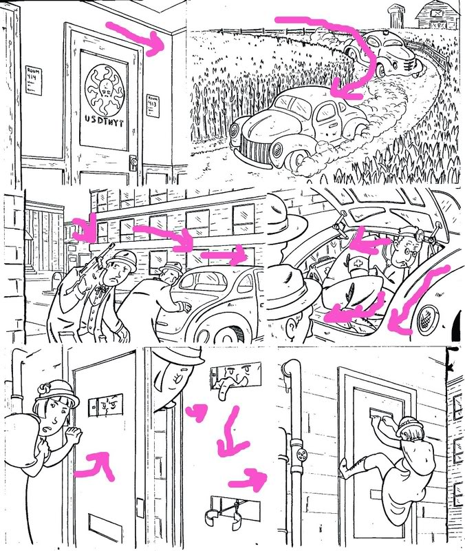
panel
1- the angles of the wall and door lead you down into the next panel.
Panel 2-The swooping curve of the car chase leads you down into the first panel
of the next tier.
Panel 3-The body language of the first man leads you to the
second man who's body language leads you to the car that flows into the
next panel.
Panel 4-The doctor is looking out of the car and just for good
measure the swooping line of the bottom of the trunk leads you to the
next tier.
Panel 5-The woman is leaning to the right and about to knock on the door to the
right.
Panel 6-The man is pointing down to the slot with a
grabber that pulls you into the next panel. The final panel has the
woman facing away from the end of the page.
Truth be told the panel with the grabber might have flowed better if it
was a mirror image, but since it was the second to last panel and didn't
make THAT big a difference I did it this way to aid the OVERALL
composition of the page.
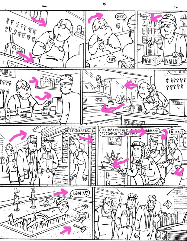
Again
basic stuff, but using the eyes of the characters to help move the
readers eyes. Magicians have known for decades and decades that the
audience will look wherever you are looking. If a central figure is
looking down, the reader will naturally look that direction next, unless
directed otherwise by some other element.
Panel 1-Counter line,
and tilted camera tips the reader into the next panel.
Panel 2-Clerk
looks up into following panel.
Panel 3-Customer looks back into the page.
Panel 4- the clerks arm and fingers point to the next panel.
Panel 6- The clerk
looks back into the page and the line of the bumpers and bottom of the
window slides the reader down to the next tier.
Panel 7-The woman leaning out of
the door draws you into the next panel because the eye is often drawn to
openings i.e. windows open doors holes ect. I didn't mention that yet
but it is a nice tip to remember, the eye likes to look into
things/openings
Panel 8-
The next panel is pretty
neat, it
creates a curve starting with the guy with glasses to the woman who's
hands loop you around to the cop who is going left and down.
Panel 9-Finally the
Indian guy is looking into the last panel and his bed of nails makes a
implied arrow to the last panel as well.
Panel 10-Last panel has a front of a car
that braces the reader from going off the page.
Again…whether or not the reader should be lead off the page or back
into the page in the last panel is sort of up in the air. In the golden
age they lead people back in…in the Marvel age they started letting
the eye flow right out. I tend to trust golden age technique unless I
have a good reason because well…they where as a whole much more
reliant on technique then and probably had a important reason for
this…maybe.
This last page…is full of advanced stuff that I have come up with on
my own. This is not to say no one else ever thought of in, just that I
came up with it through trial and error and a lot of thought.
Not every page can rely on body language and blatant background lines.
Sometimes for the sale of the story you have to be a little more clever.
So this next one uses camera placement to help things along.
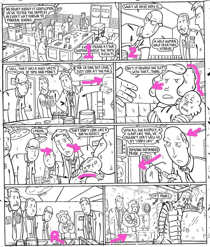
Panel 1- is a establishing shot. And I placed the camera to look down from
the lower right of the panel. This makes the reader feel as though that
is where they are standing- Lower right-this makes the transition to the
next panel pretty natural.
Panel 2- the reader, again via camera
angle, is in the lower left corner. So even though the position of the
camera is vastly different in the story reality, the page reality is
that the read only feels like they turned their head as though they
actually are existing/waiting in panel 3. Also in the second
panel the men are looking down leaving the reader in that
corner…making it again as though the readers is only turning slightly to
wind up in the next tier.
Panel 4-Just
for good measure the word balloon and their tails are all hugging the top of this panel drawing them back to
the proper starting point –top left. (more on using the word
balloons themselves to your advantage some other day) The man's arm obviously throws you
to the next panel.
In panel 4 the woman is looking in and her back is a thicker line than
the background, creating a barrier against going off the page.
Panel 5 has all the men looking at the woman and child from left to
right. The child's arm is reaching towards the next panel. *note the
woman's back is cut off and there in no thick line to deter eye
movement. As in panel 4
Panel 6 Pretty straight forward…the man is looking down and leaning
towards the next tier. Also the camera is looking up from that tier
again making a comfortable transition down.
Panel 7 is all about a pause but it also pushed the reader back. This is
important because in the next panel the reader is inside the tank with
the creature. If in panel 7 the reader was among the people the
transition to the next panel/being in the tank would not be as
effective.
All of these wild camera angles also add to the suspense and feeling of
something supernatural going on. With out all this it would just be a
bunch of talking heads in front of a counter and the punch line would
seem odd and perhaps out of place. The brunt of this joke is that the
supernatural creature is just a deadbeat dad. The more supernatural it
all seemed the funnier (in theory) it is to find out how ordinary the
creature is.
There is a time and a place for pages of talking heads too. When you are
talking about a longer story they can be a nice set up for a page or two
of impactful pages. You may notice that I do this with the donut and
voodoo joe from time to time. A series of pages with standard shots only
to out of the blue jump to trickier shots when something bizarre is
happening. That's what I call the "long con" not every page
can or should be a visual master piece. A boring page or two when well
placed is a nice tool to use.
Hopefully I didn't lose to many of you or bore the rest. These are
things the pros all consider when laying out a page…and by pro I mean
people who are more than just drawing pretty pictures…people who are
trying to tell a story.
Here is a nice game to play during convention season- go around to the
"pros" and pick out a page they have done at random and ask
them what techniques they used or why they laid to page out the way
they did. Feel free to say something condescending to those who have
no answer like "yeah it shows" or "you should really put
some thought into it next time". If they have a good answer tell
them they did a nice job. Thank them for putting more thought into it
than how big the boobs should be.
Report back here with your results ESPECIALLY if they tell you something
I don't know yet!
|