|
techniques and secrets of Arsenic Lullaby
here just a sample/test page of some of the techniques that are used in telling a story with the comic book medium...in the weeks that follow I'll put up more and more. it's not just pictures with word balloons. a lot of things must be considered. timing, panel composition, page composition, leading the eye, putting emphasis on specific objects/information/movements, mood, and on and on...so if you are an aspiring Comic book illustrator or just a fan who wants to know what separates the men from the children...read on and come back for more next week
First I'll just reassure you
fans that you are not getting a free education here. The
techniques I'm explaining in this blog are the VERY BASICS, things I
learned years and years ago. As basic as they are it seems that
some "top tier" pros out their have never learned them.
They just started drawing pretty pictures in their notebooks in grade
school and never advanced farther than that as far as learning any
SKILL. See there is TALENT, that's what you're born with, and
there is SKILL, that's what you learn. Telling a story with words
and pictures working together in sequence is a SKILL with theory and
technique and so on.
A few basic things you need
to know- a panel is a single frame/square…one single box. And
tier is a row of panels. We read from left to right in
this country…and so the action and timing should also go from
left to right. Because we read from left to right things
on the left are perceived as having happened BEFORE things on the
right…this is the number one RULE not theory but RULE….we can't get
around this one- things happen first on the left and from the top
THEN the bottom of the panel. The top to bottom rule is somewhat
looser you can, through technique, wiggle around that a little.
In the golden age of comics
most pages where two panels wide and three tiers. When you see
people making books where every page only has two tiers it is not
because they are really good. Think of them as musicians who only
know two cords…they don't know how to use the panels to set a mood or
create a sense of timing.
Certain panels are used for
certain reasons. ONE- timing. A long panel is perceived as taking a
longer amount of time to happen than a short panel (see below)
Now if the entire page
consisted of short panels the "slap" would have much less
impact. But putting several wider panels before it gives the slap
more impact. This is what I'm going on about with using at least
three tiers. You are leading the reader…setting the reader up.
Think of it as a pitcher throwing five fastballs in a row, then out of
the blue throws a curveball. It's much more effective because the
batter is used to seeing the ball come in straight. It's about
discipline. The pitcher would love to mix it up more but that would harm
the effectiveness of the curveball. a comic books is 32 pages and
you have to think of it as one long con job. Every page has to
help give meaning to the other.
The next thing panels are
used for is creating mood. A lot of this is theory but theory that
is widely agreed on. A simple square panel is
ordinary…comfortable…it gives the reader no unease simply by it's
shape. A tall narrow panel is uncommon; we don't see tall narrow
picture frames with our mothers in them. We get a tall narrow view
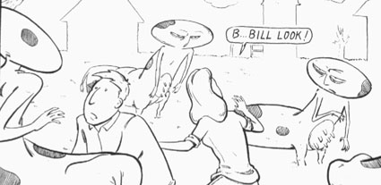
when we are peaking through a crack in a door. Take the page below.
The top tier is meant to be
creepy and unsettling the tall narrow panels help this. And when
the story's mood needs to change from how creepy Joe is to how ordinary
and usual he can act, the panels become square…ordinary. See
creepy Joe- narrow, average Joe Complaining- Square.
Is this the only thing that made this page
work? No, but that is my larger point. many many techniques must work
together and be thought out. I'll also point out here that a sense
of timing worked hand in hand on this one. The short panels went
by quickly then the longer panels slow the reader…we quickly point at
the fetuses and slowly dwell on the situation along with Joe.
Sometimes techniques are at odds with one another; I got lucky on this
page. When they are at odds is when the storytelling must come
first, which is more important? The timing or the mood?
lets take about what goes on
IN the panels. I already mentioned that things happen from left
to right, and for the most part top to bottom. The action needs to
follow this path just like the word balloons follow the path. You
have to lead the reader around the page.
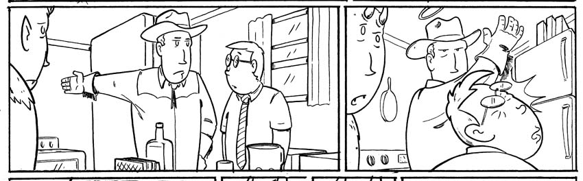
Let's take a page made up
entirely of Joe beating a guy with a tire iron.
Nowadays your average loser
would just draw one panel of Joe beating someone with a tire iron and
then copy and paste it 7 times...here is why that person would be a
loser…
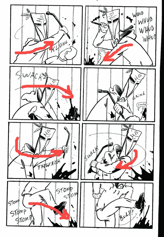
Panel one Joe's arm leads the
reader into the next panel
Panel two Joe's left arm is
pushing down into the third panel
Panel three Joes swing leads
the reader into the fourth panel
Panel four HERE is where we
want the action to slow but keep the same panel size...SO we eliminate
any motion and add a word balloon...this makes the reader slow down just
a bit because there is something to read rather than just movement to
follow. Tricky eh?
Panel fives' swing leads into
panel six
Panel six's' swing leads back
and down into Panel seven.
Panel seven Joe is stomping
towards panel eight.
All of this rhythm and
movement would be lacking by just cutting and pasting like a child.
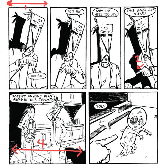
Here's another one that is a
good example
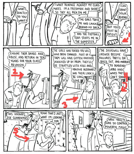
1 The boy looks over his
shoulder and down into the next tier
2 Joe and the boy are moving
forward into the next panel
3 Joe shoves the boy towards
the next panel
4 Joe pulls the boy back and
down to the next tier
5 Joe pushes the boy into the
next panel.
Now the last panel the boy is
walking off the page. In the golden age of comics the agreed upon
techniques was to lead the eye back away from that bottom right corner
of the last panel…somewhere in the marvel age they just let the
readers eye flow right off the page. No one I've talked to seems
to know why it changed or if one is better than the other..OR they are
so old they can't remember. WELL there you go a glimpse into the phone books worth of things you should know before crafting a story with a comic book. Some pages need all mood and no timing some need both some in turn rely on techniques and tricks of the eye I haven't gone into here, yet. I hope this wasn't to dry for you all and hopefully you'll have a better appreciation for the medium itself.
|